top of page
Challenge
-
Add differentiated value in a crowded space (restaurant apps).
-
Be respectful of data privacy preferences while keeping the user experience streamlined.
-
Integrate the new design into an existing design system.
outcome
A service and features incorporated into an existing design system (DoorDash).
client
team
Arity (location data analysis)
Team of 3 designers at Northwestern University
strengths
Information Hierarchy
Working With Technical Constraints

Advocating for the User

Project Management

Challenge
-
Add differentiated value in a crowded space (restaurant apps).
-
Be respectful of data privacy preferences while keeping the user experience streamlined.
-
Integrate the new design into an existing design system.
outcome
A service and features incorporated into an existing design system (DoorDash).
client
team
Arity (location data analysis)
Team of 3 designers at Northwestern University
strengths
Information Hierarchy
Working With Technical Constraints
Advocating for the User
Project Management
repurposing a tracking device
How can a device that keeps kids safe be used by adults on international trips?
Challenge
-
Identify a new application for a GPS tracking device
-
Re-design the digital interaction for 3 new use cases
-
Maintain the Jiobit brand integrity
outcome
A new UX flow and interface targeted for adults on international service trips.
client
team
Jiobit (sell a tracking device and app that helps keep track of children or pets)
5 designers at Northwestern University
Integrating into Existing Brand
strengths
Information Hierarchy
Identifying opportunities

final design
Our team created UX flows for the tracking device app to be used in 3 different use cases as well as updates to the physical tracking device and a business model design. I was responsible for creating the flow and UI for international service trips, so I will focus on that portion of the design below.
My design met the needs of those on international service trips by:
-
providing a sense of security in an emergency
-
creating a way to plan for trips
-
enabling team members to share locations and communicate

<a href='https://www.freepik.com/psd/mockup'>Mockup psd created by rawpixel.com - www.freepik.com</a>
Background
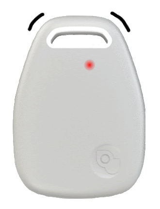
Jiobit is a company that designed a GPS tracker that is used primarily to prevent children and pets from getting lost. The device is more reliable, lightweight, and subtle than their competitors. We were interested in determining whether these mobile, subtle devices could be used to help adults feel safe during their own travels.

design process
Secondary Research
Design Requirements
Mood Board
Ideate
and Prototype
Brand
Integration
Final Design
Secondary research
This project was focused more on the iteration of design rather than design research, but we conducted secondary research on what was needed for the different use cases.
I found it was important that the product work even in areas that had limited cell service, and that it be discreet.
While work locations largely stay the same throughout the trip, I wanted the design to be able to accommodate any changes in "safe" locations or work zones. Lastly, it was important that team leads could contact or at least know where their team members were in an emergency.


design requirements
Based on the secondary research we conducted, these guiding principles helped me to identify the user flow and design.
1
Provide timely help during emergencies.
2
Include a way to plan for upcoming trips.
3
Accommodate changing work and "safe" zones throughout the trip.
Mood Board
To get an idea of what our visual identify would be while keeping the product on-brand, we made mood boards for each different case (international service trips, study abroad, and international tours - my use case was international service trips). This helped us ideate around how the UX and UI could differ for the 3 different use cases. I wanted to create a feeling of empowerment and peace while also keeping references to the volunteers' impact. Ultimately, I decided to preserve the branding and only make minimal changes.

Ideation & Prototyping


Our team ideated around features that would address the design requirements. We ended up with a list of features for the program leader and attendees, and later prioritized these features.


I iterated around user flow and screen layouts, starting first with sketches and then moving into Figma. We got feedback from teammates and mentors along the way.
Some of the most impactful decisions I made were around how to include the emergency related functions, and how to represent the buttons. I also iterated on the flow for trip planning to make sure that it would help team leads remember what needed to be planned without being too structured.
brand integration
Our team had already studied the current Jiobit app by testing it out ourselves, and my teammate Yiwen did an extensive study of the UI. We used this to inform our own design system in Figma. We wanted our designs to integrate into the existing visual brand so our client would see this as an extension of their current product.
Some of the branding aspects that we made sure to include were:
-
the same style of menu with circular icons
-
the ability to switch between screens by swiping
-
the same design of the location dashboard
-
the feel of the font and layouts
We chose to change many aspects of the UX flow. For international service trips, this was because I wanted to focus more on planning and emergencies than was done in the existing app.

Original Main Menu
My Design Main Menu

final product
The Jiobit device would attach to the clothing of volunteers and would be sturdy enough to withstand days of manual labor.
My teammate Nic made a rendering of what the device might look like with American Red Cross branding, for example.


While on the trip


-
Easy to navigate menu
-
Clear list of team members with a way to see if their Jiobit device is charged.
-
Easy to find the location of others and see the "safe zone" boundary.

-
Allows team lead to call the team to the lead's location
-
Easy to find local authorities contact information or location
-
See the location of all team members in one place
-
Find individual team members' locations from the page instead of having to go to the other dashboard
Perhaps the most important screen, this is the dashboard to use in emergencies. The two buttons at the top are red because they needed to be easy to find and would be used less often than others. I iterated quite a bit on what would be the most obvious location and what functions would be needed.

-
Alerts both Jiobit device and phone in an emergency
In the event of an emergency, the team members would receive an alert to their Jiobit and phone. This is because in this use case, it's more likely that the Jiobit is working and is on their person rather than their phone.
Team members can also signal an emergency situation by holding down the button to their Jiobit and this will alert the team lead.

-
Notifies team members if work or safe zones change
If work sites changed from day-to-day, participants would get notifications that the safe zone has changed and be able to see what the old and new zones were.
before the trip


-
Team leads have the ability to plan trips ahead of time so they are not having to do planning work while on the trip.
-
Trip plans have different sections that help team leads know what they should be planning in advance.
feedback
We presented designs to meet the needs of 3 use cases to Jiobit leaders. This included 3 UX designs, a modified physical product design, and a business model design.
The client especially loved our attention to detail around privacy concerns and action needed in an emergency and were inspired by the direction we took with the product.
If we had more time and resources for this project, I'd like to spend more time on research and user testing. I also have some ideas around how the emergency functions could be improved.


Previous project
_edited.jpg)
UX Internship
I helped engineers get a handle on the security of their cloud infrastructure... read more
_edited.jpg)
UX Design
_edited.jpg)
Service Design
_edited.jpg)
UX Design
Jiobit is a company that designs location trackers to keep track of young children. We explored how to repurpose that technology for new applications... read more
_edited.jpg)

_edited.jpg)
everyone's garden
sustainable packaging
UX, Service Design Thesis
Physical Product Design
I explored how we could make community garden participation more accessible for people with little time to devote... coming soon
Ever had a frustrating experience trying to open medicine? Medicine packaging is usually difficult to open and not sustainable. We helped our client dream up a more sustainable package ... coming soon
bottom of page